It’s gloves off, we have new contenders for the title of Heavy Weight Logo Champion of the world. 3 more entries to get in the ring so we’re putting them head to head in the cage for an all out brawl against the best two from the previous round.
Tears will be shed. Tears of the designers of the loosing entries. But we’ll save their shame. We will only announce the winner.
The people that were paying attention earlier will note that there is no “Coat of Arms” logo entry.
We did consult with a skilled expert on the subject of Coat of Arms style logos early today. In fact a 16th century hipster, Johan Casimir Dei Gracia, Duke of Saxe-Coburg in the latter half of the 16th century.
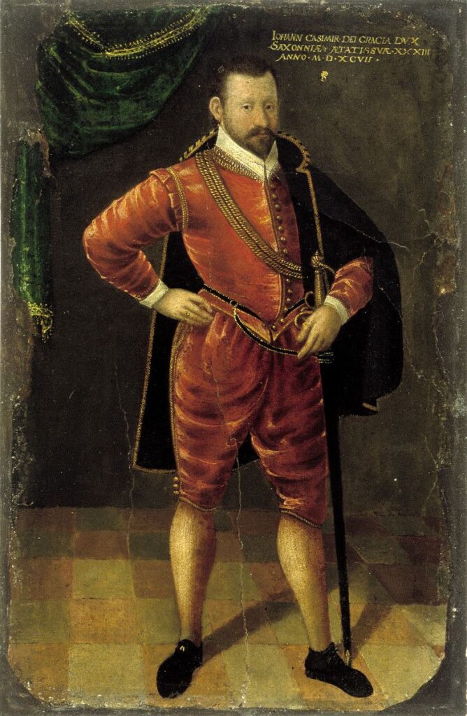
Through the wonders of a hotline back in time (also known as an ouija board) we consulted this setter of trends, definer of fashion and wearer of pantaloons and asked him if a coat of arms logo was cool. He laughed, gave a golf clap and pointed out that even in his day they were considered out of fashion and rather old hat.
The Options
Here are the scribbles we are playing with right now.
Option 5
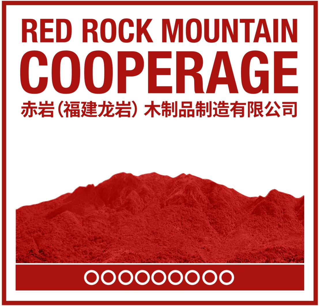
Inspired by the very mountain that gave this project it’s name, this uses a red filter across the image, the same type face as Nine Rivers Distillery and 9 circles to represent the 9 touch points between Nine Rivers Distillery and Red Rock Mountain Cooperage.
Option 8
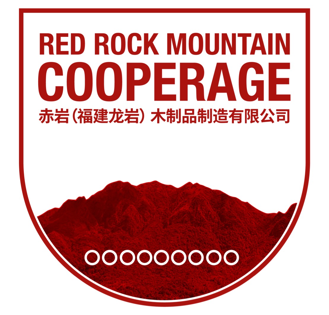
An alternative interpretation of the previous logo, showing sculpted curve curves across the bottom of the main branding device, to communicate the feeling that Red Rock Cooperage is one half of the complete lifecycle of whisky (with Nine Rivers Distillery being the other half)
New Design 1
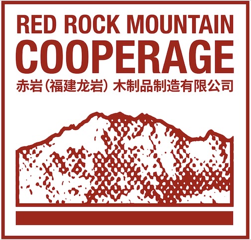
A simplified version of Option 5 above, building on the key messages of Option 5 but without the photo realistic imagery.
New Design 2
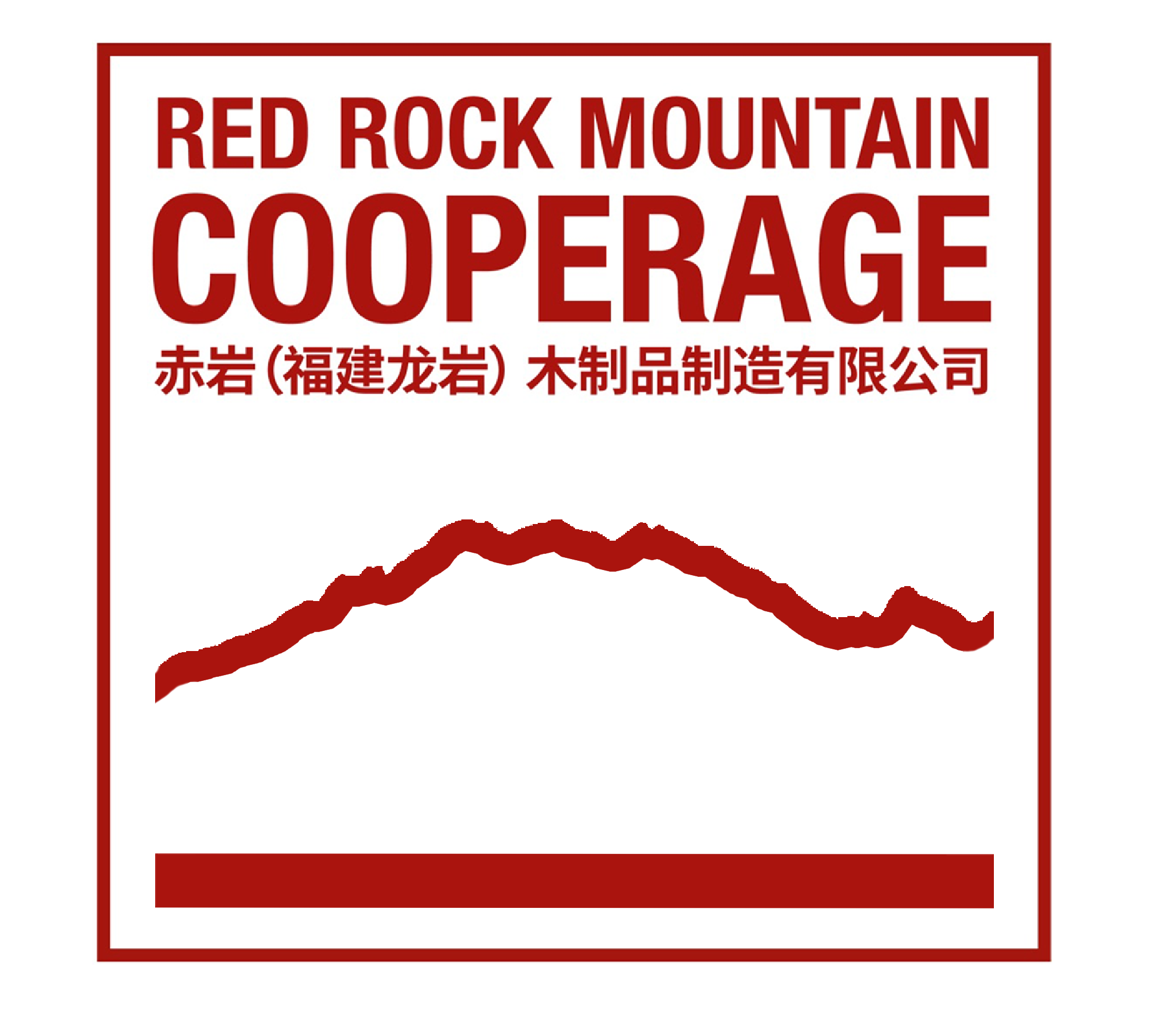
This example takes all of the key points of all logos by presents them in a style that would apply better in the use of a branding iron. Being able to brand (in the context of a hot iron, to burn into the wood) the barrels is a really key requirement for the project. This interpretation of the logo would be the easiest to turn into a branding iron stencil and would ensure consistency in both corporate communications and the products themselves.

New Design 3
A final interpretation of simplification to ensure branding iron compatibility. However, this logo is design to accommodate some space to enhance the logo at a later date, and insert a visual representation of the final cooperage building (or buildings) architecture. Adding a building outline in future ensures that there are still strong connections between early branding, and post architecture branding.
Voting Time
PLOGO 2
Choose Your Favourite Logo
Got An Alternative?
Too late now innit.
Broader Pool of Voters
We will open this up to the broader community to include Friends of 9RD. We need big numbers on the votes to make them have any meaning.